
CWA Case Study: Courageous Women Association — Enduring Brand, Timeless Design, and a New Digital Era
- Feb 14
- 5 min read

“I’ve known Toshonna Ross for nearly three decades — first through music, then through mission. Watching Toshonna Ross build the Courageous Women Association into a lifeline for women in crisis has been awesome to witness. What she has sustained over decades, often while balancing a full-time career, has transformed countless lives. Her consistency, strength, and refusal to quit are the real engine behind CWA’s longevity, and I’m honored to have supported that mission through design.”
Peter Bogdanov
For over two decades, Courageous Women Association has been a beacon of stability and transformation — not just for the women it serves, but for the very idea of nonprofit branding itself. In a world where most businesses (including nonprofits) struggle to survive past the first five years, CWA has not only endured — it has thrived with brand continuity and clear mission focus. According to U.S. Bureau of Labor Statistics data, only about half of new businesses make it to five years and roughly one-third survive to ten years or beyond — figures echoed by multiple economic surveys on small business longevity.(The Zebra)

From the original logo redesign to nearly a decade of digital presence on the original Bogdanov-built website, and now to a 2026 redesign crafted to meet modern UX expectations and technology, the CWA story is a textbook case in brand gravity — building a visual identity and digital experience that resonates with users long enough to become iconic.
Part I — The Power of a Timeless Logo

When CWA first approached Bogdanov Brand Gravity Studio for a logo redesign, the original mark lacked visual coherence and storytelling strength. We didn’t just reshape letters. We interwove a woman’s profile into the negative space of “CWA”, creating a visual metaphor for courage, presence, and human focus.
The mark has endured unchanged for over 20 years — a rare achievement in logo design — and that longevity illustrates a core Bogdanov principle: A truly successful logo doesn’t date. It anchors. It becomes part of cultural memory rather than a momentary stylistic trend.
This isn’t just vanity. Logos that persist without redesign help nonprofits retain brand cohesion and recognition, which is essential when your audience includes people dealing with trauma, instability, and crisis. Consistency builds trust; trust builds engagement. The timelessness of the CWA logo is part of the reason it still reads as confident, compassionate, and real.
Part II — The Digital Journey: First Website
Years ago, we built CWA’s website — a design that would serve the organization with distinction for decades. That longevity alone is noteworthy: for most nonprofits, platform changes, SEO shifts, mobile trends, and technology churn meaning a redesign every 3-5 years. That CWA’s site remained functional, relevant, mobile-friendly, and mission-aligned for nearly ten years speaks not just to craftsmanship, but to strategic foresight in design and platform choice.
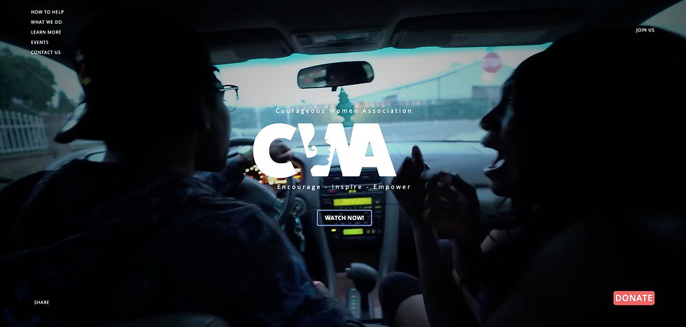
At launch the site featured a dramatic opening video — a woman in distress — intended to immediately communicate the severity of CWA’s mission and the space they hold for women in crisis. This kind of emotional storytelling is a common strategy in nonprofit UX (and a central tactic in traditional fundraising psychology), but in recent years it’s been overused to an extent that breeds anxiety in users and conditions them to fear-response engagement.
Part III — 2026 Website: The Psychology of Welcome

With the 2026 redesign, we took a step back from conditioning visitors through shock or fear toward solutions. Instead, we took inspiration from modern UX research that emphasizes balance:
Above-the-fold experiences should inspire first. Users are served hope first, before they meet the harder emotional content down the page.
Mobile-first layout and readable content. Today’s users overwhelmingly browse on mobile; long blocks of text and non-responsive content are barriers to engagement. We redesigned with moderate text density and intuitive scrolling.
Soft visual entrance. Rather than stark geometry and sharp edges — which can feel intimidating or “entry barrier”-ish — we used curved graphic breaks, gentle navigation cues, rounded buttons, and controlled negative space. These subtle visual cues help put visitors in a state of comfort and trust, setting a stage where a battered woman, a donor, or a volunteer feels safe enough to take action.
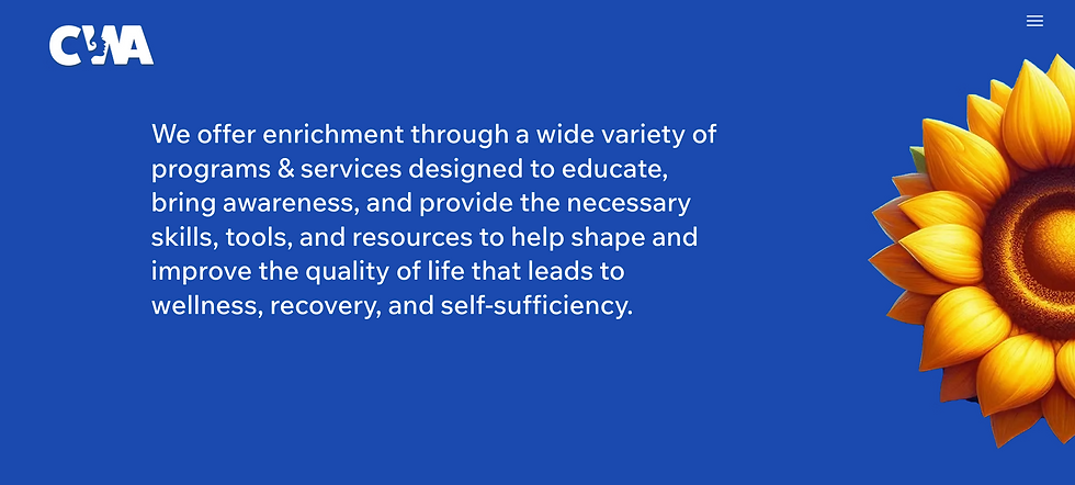
Iconic imagery with context-neutral warmth. Instead of garden scenes or generic stock photos, we use isolated floral imagery colored to match the CWA palette. These evoke calm, softness, and emotional grounding without distraction.
These strategies align with nonprofit web design best practices that emphasize clear mission statements, mobile friendliness, easy donation paths, consistent branding, and accessibility — all backed by industry research.(Wild Apricot)
Color & Emotion: Science Behind the Choices
Color is not decoration; it’s communication.


Design research notes that:
Cool tones like blue build trust, security, and calm — essential for a nonprofit supporting trauma recovery.(Wire Media)
Warm accents can guide action and support calls to donate, volunteer, or contact.(NonProfit PRO)
Accessibility requires contrast and legible interactive elements — a design choice we incorporated into every button and content hierarchy.(blog.mightycause.com)

The new CWA site uses its brand palette not as ornamentation, but as a psychological support system that reinforces safety, clarity, and connection.


Brand Gravity in Practice
Brand gravity isn’t a buzzword. It’s the force that keeps audiences attracted to a mission, that keeps donors engaged across years, that makes a user return to a site not because it’s cute, but because it feels right, aligned, and trustworthy.

CWA’s identity has done this for decades. Few nonprofits can point to a consistent brand over 20+ years. Fewer still can claim a digital presence that lasted a decade without feeling dated. That’s strategic brand design.
The Bigger Picture: Nonprofit Longevity
Statistically, most small enterprises — including nonprofits — don’t last ten years. According to the U.S. Bureau of Labor Statistics, only about a third of establishments born in a given year are still operating ten years later.(Bureau of Labor Statistics)


CWA isn’t just surviving. It has thrived, even through economic downturns, shifts in technology, and evolving donor expectations. Its endurance is a testament to:
Clear mission and values
Consistent visual identity
User-centered digital experience
Adaptation without abandonment of core identity
Conclusion: Courage, Design, and Forward Momentum
The Courageous Women Association exemplifies what happens when purpose meets thoughtful design. Its identity isn’t a relic of the past, but a foundation for future innovation. The 2026 redesign honors the legacy while preparing the organization to connect with new generations of supporters and those they serve.

This case reminds us that good design isn’t decoration. It’s infrastructure. It supports mission, builds trust, and enables engagement across lifetimes, not quarters.
To CWA and its leaders: your work shapes lives. Good design tilts the world just a little more in favor of endurance, dignity, and hope.
Sources & Further Reading
Brand & Color Psychology:
Color Speaks Louder than Words (Nonprofit color meanings).(Wire Media)
Color Theory 101 for nonprofits.(118group.com)
Color best practices and the 60-30-10 rule.(NonProfit PRO)
Website UX & Design:
Nonprofit website design best practices.(Wild Apricot)
Accessibility and color in nonprofit websites.(blog.mightycause.com)
Business Longevity Stats:
Small business survival rates.(The Zebra)
Long-term survival statistics by BLS.(SBE Council)


